As part of today's release of the Mono Packager for OSX we have issued a new MonoMac refresh.
As we create more sample code, and start to write real applications with MonoMac, we have updated the API to be simpler, cleaner and more comprehensive. This release is all about small incremental improvements to the MonoMac API.
As usual, we have updated the our MonoMac API documentation MonoMac API documentation. If you are thinking about getting started with MonoMac, we strongly recommend you read our MonoMac page for some useful links and tutorials.
Statistics
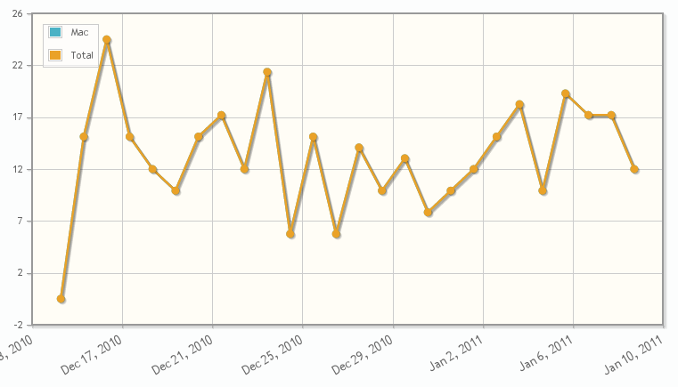
MonoMac 0.4 was installed by 263 developers, MonoMac 0.5 by 369 developers. Interesting considering that the holidays are a slow season:

Apps!
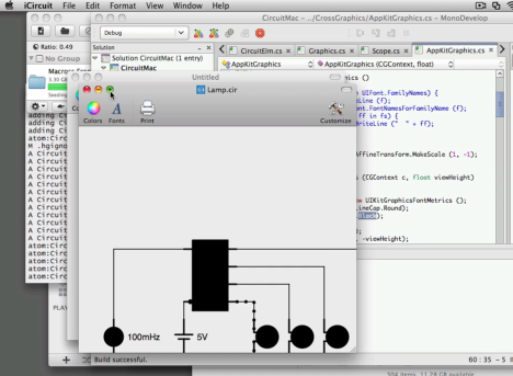
Frank Krueger the creator of iCircuit a real-time circuit emulator and editor for the iPad/iPhone has started a port of iCircuit to MacOS X using MonoMac:

Pretty amazing, considering that Frank only learned to use MonoMac yesterday (although he does have extensive MonoTouch experience). Update: He posted and updated screenshot "now in technicolor".
MacDoc Sample
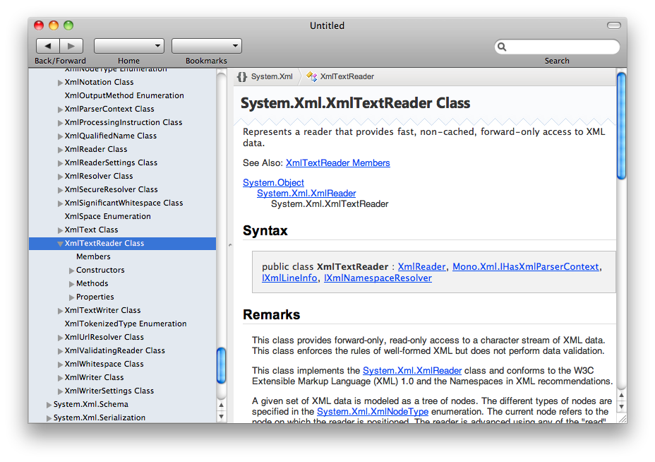
During the holidays, I wrote MacDoc a native front-end for the MonoDoc documentation engine. I also took Jonathan Pobst's fabulous style sheets from Kipunji to spice up the UI a little bit.
This is the result:

I still have to integrate the index and search features of MonoDoc into the UI, and I am struggling as to how to surface them in the UI.
The Index is supposed to have an alphabetical listing of classes, method, properties, fields, similar to the index at the end of a book. I always found this to be very useful when developing with .NET. The search functionality on the other hand uses Lucene to search in the documentation body.
At this point, I believe that I should add a tabbed widgets, and let the user pick between the tree view on the left and the index (with a new text-entry to do the incremental search). But if the users uses the search on the toolbar, I should replace the tree and the index with a list of results.
Does the above make sense, or you think it is a terrible UI idea and completely unacceptable for OSX users?
I thought about merging the index and the body search, but it would render the index search a bit useless. Anyways, if you are a Mac expert, please send feedback my way.


