Markdown Style Guide
Markdown is as a file format for easily producing text that can be pleasantly read both on the web and while using command line tools, or plain text editors.
Recently, a crop of tools have emerged that deliver some form of WYSIWYG or side-by-side authoring tools to assist writers to visualize the final output as they work.
Authors are turning to these tools to produce documentation that looks good when authoring the document, yet the tools are not true to the spirit and goals of markdown. And in some cases, authors are not familiar with the essence of what makes markdown great, nor the philosophy behind it:
Readability, however, is emphasized above all else. A Markdown-formatted document should be publishable as-is, as plain text, without looking like it’s been marked up with tags or formatting instructions.
Using these editors is the modern equivalent of using Microsoft Word to produce HTML documentation.
The generated markdown files very easy to produce, but are not suitable for human consumption. They likely violate a number of international treaties and probably will be banned by the EU.
This short post is a set of simple rules to improve your markdown.
They will help you deliver delight to all of your users, not just those using a web browser, but also those casually reading your documentation with a file manager, their console, and most importantly, potential contributors and copy editors that have to interact with your text.
Wrap Your Text
The ideal reading length for reading prose with a monospaced font is somewhere between 72 and 78 characters.
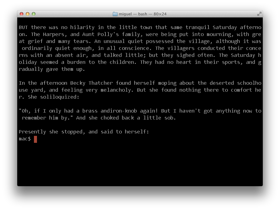
This is text snippet is from Mark Twain's Adventures of Tom Sawyer, with text wrapped around column 72, when reading in an 80x25 console:

It wont matter if you are using a larger console, the text will still be pleasant to read.
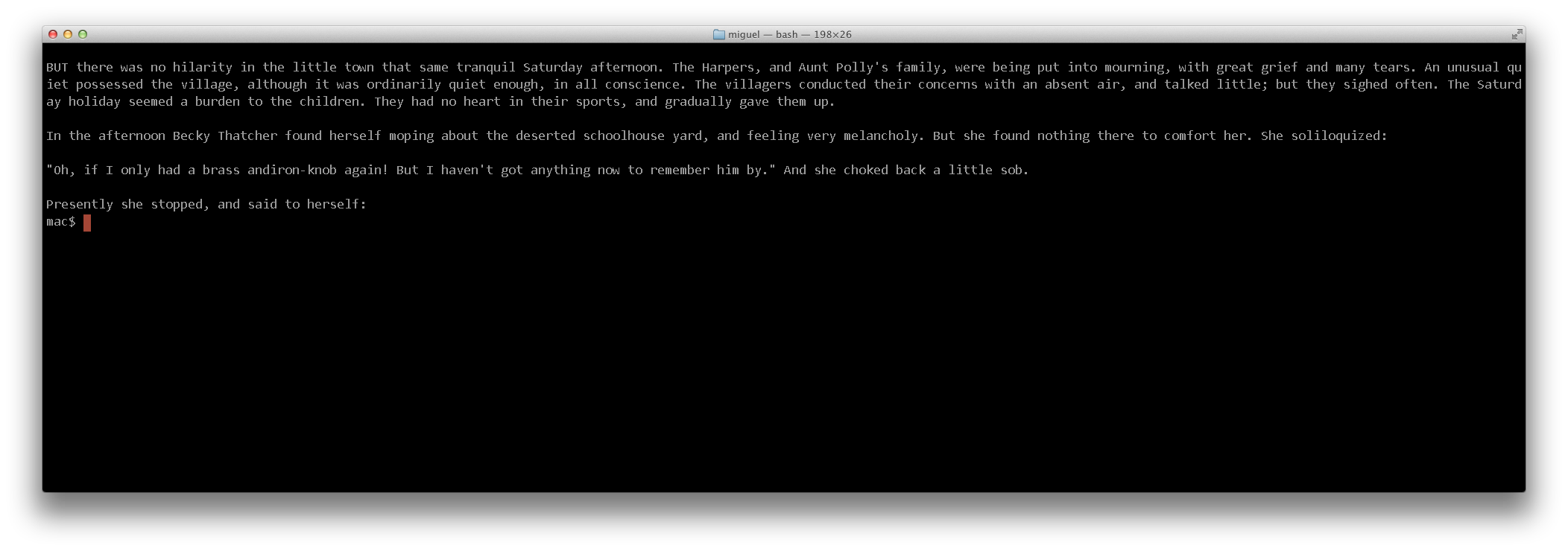
But if you use some of these markdown editors that do not bother wrapping your text, this is what the user would get:
And this is what is more likely to happen, with big consoles on big displays:
There is a reason why most web sites set a maximum width for the places where text will be displayed. It is just too obnoxious to read otherwise.
Many text editors have the ability of reformatting text your text when you make changes.
This is how you can fill your text in some common editors:
- Emacs: Alt-Q will reformat your paragraph.
- Vim: "V" (to start selection) then "gq" will reformat your selection.
- TextMate: Control-Q.
Considering Using Two Spaces After a Period
When reading text on the console, using two spaces after a period makes it easier to see where phrases end and start.
While there is some debate as to the righteouness of one vs two spaces in the word of advanced typography these do not apply to markdown text. When markdown is rendered into HTML, the browser will ignore the two spaces and turn it into one, but you will give your users the extra visual cues that they need when reading text.
If you are interested in the topic, check these posts by Heraclitean River and DitchWalk.
Sample Code
For small code snippets, it is best if you just indent your code with spaces, as this will make your console experience more pleasant to use.
Recently many tools started delimiting code with the "```". While this has its place in large chunks of text, for small snippets, it is the visual equivalent of being punched in the face.
Try to punch your readers in the face only when absolutely necessary.
Headers
Unless you have plans to use multiple-nested level of headers, use the underline syntax for your headers, as this is visually very easy to scan when reading on a console.
That is, use:
Chapter Four: Which iPhone 6 is Right For You.
==============================================

In the previous chapter we established the requirement to buy iPhones
in packs of six.  Now you must choose just whether you are going to go
for an apologetically aluminum case, or an unapologetically plastic
iPhone.
Instead of the Atx-style headers:
# Chapter Four: Which iPhone 6 is Right For You.
The second style can easily drown in a body of text, and can not help as a visual aid to see where new sections start.
Blockquotes
While markdown allows you to only set the first character for a blockquote, like this:
> his is a blockquote with two paragraphs. Lorem ipsum dolor sit amet,
consectetuer adipiscing elit. Aliquam hendrerit mi posuere lectus.
Vestibulum enim wisi, viverra nec, fringilla in, laoreet vitae, risus.
Editors like Emacs, can reformat that text just fine, all you have to do is set the "Fill Prefix", by positioning your cursor after the "> " and use Control-x ., then you can use the regular fill command: Alt-Q, and this will produce:
> This is a blockquote with two paragraphs. Lorem ipsum dolor sit amet,
> consectetuer adipiscing elit. Aliquam hendrerit mi posuere
> lectus. Vestibulum enim wisi, viverra nec, fringilla in, laoreet
> vitae, risus.
Lists
Again, while Markdown will happily allow you to write things like:
*   Lorem ipsum dolor sit amet, consectetuer adipiscing elit.
Aliquam hendrerit mi posuere lectus. Vestibulum enim wisi,
viverra nec, fringilla in, laoreet vitae, risus.
*   Donec sit amet nisl. Aliquam semper ipsum sit amet velit.
Suspendisse id sem consectetuer libero luctus adipiscing.
You should love your reader, and once again, if you are using something like Emacs, use the fill prefix to render the list like this instead:
*   Lorem ipsum dolor sit amet, consectetuer adipiscing elit.
    Aliquam hendrerit mi posuere lectus. Vestibulum enim wisi,
    viverra nec, fringilla in, laoreet vitae, risus.
*   Donec sit amet nisl. Aliquam semper ipsum sit amet velit.
    Suspendisse id sem consectetuer libero luctus adipiscing.
Posted on 30 Sep 2014
Blog Search
Archive
- 2024
Apr - 2020
Mar Aug Sep - 2018
Jan Feb Apr May Dec - 2016
Jan Feb Jul Sep - 2014
Jan Apr May Jul Aug Sep Oct Nov Dec - 2012
Feb Mar Apr Aug Sep Oct Nov - 2010
Jan Feb Mar Apr May Jun Jul Aug Sep Oct Nov Dec - 2008
Jan Feb Mar Apr May Jun Jul Aug Sep Oct Nov Dec - 2006
Jan Feb Mar Apr May Jun Jul Aug Sep Oct Nov Dec - 2004
Jan Feb Mar Apr May Jun Jul Aug Sep Oct Nov Dec - 2002
Jan Feb Mar Apr May Jun Jul Aug Sep Oct Dec
- 2022
Apr - 2019
Mar Apr - 2017
Jan Nov Dec - 2015
Jan Jul Aug Sep Oct Dec - 2013
Feb Mar Apr Jun Aug Oct - 2011
Jan Feb Mar Apr May Jun Jul Aug Sep Oct Nov Dec - 2009
Jan Feb Mar Apr May Jun Jul Aug Sep Oct Nov Dec - 2007
Jan Feb Mar Apr May Jun Jul Aug Sep Oct Nov Dec - 2005
Jan Feb Mar Apr May Jun Jul Aug Sep Oct Nov Dec - 2003
Jan Feb Mar Apr Jun Jul Aug Sep Oct Nov Dec - 2001
Apr May Jun Jul Aug Sep Oct Nov Dec