Kid's Games on the iPad
My eight month old daugther loves her iPad.
We have gotten a bunch of baby games, kids games and visualizations for her.
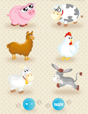
But many of these apps have one fundamental issue: the author adds one or more buttons with useless stuff like "Provide Feedback", "Info", "Visit Web Site", "Check my Other Apps" and other assorted buttons on the screen:

Now, perhaps the apps did great when used by a professional QA team in Daytona that reported back "yes, every animal in the app makes the proper sound, and the cows scroll as they are intended to".
In this case, the "Main" button, will bring up a convenient page with options to send feedback to the author, to visit his web site and check out his other apps.
This means that my daugther can not really enjoy her games without supervision, since every few seconds, she will end up visiting a web site in Safari.
Joseph has a similar problem, he has equipped both of his kids with iPads, and they routinely report "the iPad broke", every time one of their games ends up in some lame web site for the developer.
Developers for kid games should use slider switches if they really want to impose their hooks into their customers.
Some Games
On twitter Paul Hudson suggested a couple of games for 1-year olds: Uzu (my daughter also loves this one), BeBot and SoundTouch.
I have found that she likes GarageBand a lot (we just have to be around to make sure we can reset the screen when she changes instruments).
Posted on 23 Mar 2011
Blog Search
Archive
- 2024
Apr Jun - 2020
Mar Aug Sep - 2018
Jan Feb Apr May Dec - 2016
Jan Feb Jul Sep - 2014
Jan Apr May Jul Aug Sep Oct Nov Dec - 2012
Feb Mar Apr Aug Sep Oct Nov - 2010
Jan Feb Mar Apr May Jun Jul Aug Sep Oct Nov Dec - 2008
Jan Feb Mar Apr May Jun Jul Aug Sep Oct Nov Dec - 2006
Jan Feb Mar Apr May Jun Jul Aug Sep Oct Nov Dec - 2004
Jan Feb Mar Apr May Jun Jul Aug Sep Oct Nov Dec - 2002
Jan Feb Mar Apr May Jun Jul Aug Sep Oct Dec
- 2022
Apr - 2019
Mar Apr - 2017
Jan Nov Dec - 2015
Jan Jul Aug Sep Oct Dec - 2013
Feb Mar Apr Jun Aug Oct - 2011
Jan Feb Mar Apr May Jun Jul Aug Sep Oct Nov Dec - 2009
Jan Feb Mar Apr May Jun Jul Aug Sep Oct Nov Dec - 2007
Jan Feb Mar Apr May Jun Jul Aug Sep Oct Nov Dec - 2005
Jan Feb Mar Apr May Jun Jul Aug Sep Oct Nov Dec - 2003
Jan Feb Mar Apr Jun Jul Aug Sep Oct Nov Dec - 2001
Apr May Jun Jul Aug Sep Oct Nov Dec