MonoDevelop's New Search Bar
MonoDevelop 2.4 was a release in which we focused on improving the ergonomics of the IDE. We did this in dozens of places and we did this by dogfooding the IDE and comparing it to other tools and environments that we have been using.
With MonoDevelop 2.0 and earlier we used a dialog box like most other GUI applications from 2005. The dialog would remain on top of the text and the user would press next, and move the dialog box around as the matches were found.
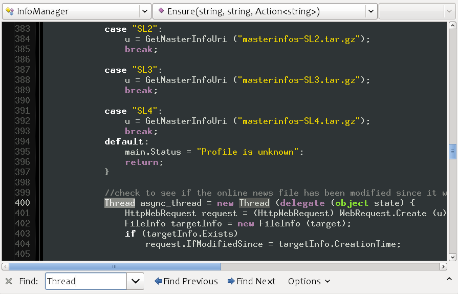
In the current MonoDevelop (2.2) we adopted a more Firefox-like UI, this is what the search bar looks like:

We have a relatively big bar at the bottom of the screen, big labels, a drop down for picking previously searched items and an options menu that would let users pick manually case sensitivity, whole world matching or toggling regular expressions.
This took too much space, in a prime location of screen real estate. Additionally, the features although present were hard to pick. You would start an incremental search with Control-f but if you wanted to change the settings, you would have to use the mouse to access the options menu. If you later changed your mind, you would have to change the defaults again.
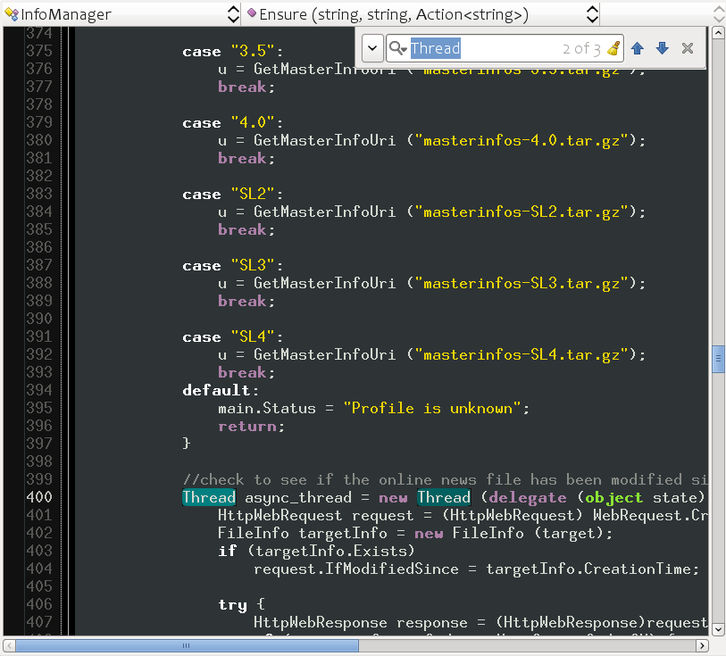
With the new release of MonoDevelop (2.4) we have changed this again, this time adopting the Google Chrome search bar and done a few other usability changes:

The first thing to notice is that instead of taking valuable horizontal space in the form of a full row, we now only take a corner of the screen, and we take it on the top right corner which is less likely to contain the information you are looking for as you search forward.
Case sensitivity searches now use the same model used by Emacs. If you start searching for a term and you type only lowercase letters, the search will be case insensitive.
Searching for "thread" will match "thread", "Thread" or "THREAD". But if at any point during the search you type an uppercase letter, then the search for this particular activation will switch into case-sensitive search. Searching for "Thread" will only match the word "Thread" and not "thread" or "THREAD".
And we also highlight matches like some Mac applications do, all matching words in the screen are highlighted, and the current match gets both a brighter color as well as a bubble that inflates and deflates on every match.
The replace functionality is built into this new UI, and is accessed either with a hotkey (Control-H) or by clicking on the left-side icon:

Just like Google Chrome, we use a watermark to show the number of matches in the document.
MonoDevelop 2.4 is packed with new features, and I hope to blog about some of the design decisions of the new feature as time permits. In the meantime, check out the list of new features in the Beta for MonoDevelop 2.4.
Posted on 06 May 2010
Blog Search
Archive
- 2024
Apr Jun - 2020
Mar Aug Sep - 2018
Jan Feb Apr May Dec - 2016
Jan Feb Jul Sep - 2014
Jan Apr May Jul Aug Sep Oct Nov Dec - 2012
Feb Mar Apr Aug Sep Oct Nov - 2010
Jan Feb Mar Apr May Jun Jul Aug Sep Oct Nov Dec - 2008
Jan Feb Mar Apr May Jun Jul Aug Sep Oct Nov Dec - 2006
Jan Feb Mar Apr May Jun Jul Aug Sep Oct Nov Dec - 2004
Jan Feb Mar Apr May Jun Jul Aug Sep Oct Nov Dec - 2002
Jan Feb Mar Apr May Jun Jul Aug Sep Oct Dec
- 2022
Apr - 2019
Mar Apr - 2017
Jan Nov Dec - 2015
Jan Jul Aug Sep Oct Dec - 2013
Feb Mar Apr Jun Aug Oct - 2011
Jan Feb Mar Apr May Jun Jul Aug Sep Oct Nov Dec - 2009
Jan Feb Mar Apr May Jun Jul Aug Sep Oct Nov Dec - 2007
Jan Feb Mar Apr May Jun Jul Aug Sep Oct Nov Dec - 2005
Jan Feb Mar Apr May Jun Jul Aug Sep Oct Nov Dec - 2003
Jan Feb Mar Apr Jun Jul Aug Sep Oct Nov Dec - 2001
Apr May Jun Jul Aug Sep Oct Nov Dec